

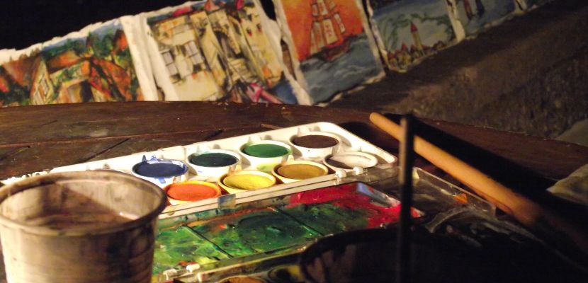
The difference between warm colors and cold colors has been part of color theory since the 18th century and the main purpose of studying these colors is to know how they can affect those who look at such paintings or designs.
This difference and the effects that both types of colors can have on art is known as the color temperature.
How to know if a color is cold or warm? It all depends on how our brain perceives that color and how we interpret the sensation that color gives us.
Knowing a little about warm colors

Warm colors are those that convey a feeling of passion, heat, energy and even closeness.
They are also often known as the colors of love and that is one of the reasons why they are widely used in advertisements, paintings and designs to get closer to customers and make them feel close to what they buy (or what they see).
What are the warm colors?
Red is the most recognized and important warm color of all, even many experts comment that the redder any color contains in its formation, the warmer it will be for the human eye.
Similarly, the answer to the question What are warm colors? The range of warm colors goes from red, through yellow, orange, brown, even reaching the different shades of ocher or gold.
You can consult the article on the khaki color that would be part of the warm colors.
How are warm colors formed?
Warm colors are those that we named above, to form other warm colors we simply need to mix the primary or secondary mentioned above in different amounts of each color.
In the same way, it is important to understand that the mixture of warm colors and cold colors can also generate a color of one or the other type (depending on the quantities we use).
Taking this into account, how are warm colors formed? It would be a much more complex answer to answer than we imagine and we simply have to understand that they are formed by taking large amounts of primary warm colors with other warm colors or with small amounts of cold colors.
Knowing a little about cold colors

On the other hand we have cold colors, which tend to give a much calmer feeling than warm colors, in this case we could even say that they bring calm. In design and art they are often used to achieve an effect that the design looks distant and the image looks poorly saturated.
Have you noticed that all police uniforms around the world are blue? The main reason is that this color shows tranquility and calm and that can help to calm people a little more.
What are the cool colors?
As with warm colors, in cold colors there is also a maximum exponent and it is precisely the color blue (the only one of the primary colors that is cold).
After that we can mention other colors such as green (in different shades), purple, violet and even gray (which is a neutral color, but many people place it within cold colors).
You can also read the article on the cyan color, which would be part of the cold colors.
As you can see, there are a lot of colors and shades that we could add and make part of the cold colors, therefore, the answer to the question What are cold colors? It is that they are the colors that are usually found in the lower part of the color wheel.
How are cold colors formed?
How are cold colors formed taking into account that the only primary cold color is blue? Well, the same thing happens with warm colors, everything will depend on the amount of each color that we add to define if the mixture generates a warm color or a cold color.
The more blue we put in the different colors, the colder the color will be. For example, green is a cold color and is formed by the union of a warm color (yellow) and a cold color in greater quantity (blue).
What is the use of knowing about warm and cold colors?
Color theory has helped many artists, designers, and advertisers to reach their clients and those who view their artwork much more easily.
The best artists in history knew all about color theory and knew that when they took each brushstroke they were looking to generate some kind of feeling in those who looked at their paintings.
This is also very common (as we said previously) in the world of design, marketing, sales and it is that clearly all brands seek to renew their logos and the way they see themselves in front of their clients, taking into account the colors they use in their banner ads and much more.
And it is that using the correct color can be the difference between success and failure, for example, if your advertising campaign, your painting or your design seeks that people feel identified with the product or that they are encouraged to practice some sport , it is not totally convenient to use mostly colors that call for tranquility, that is, it is not convenient for cold colors to occupy most of the design.
Since you know a little more about the types of colors (warm and cold), we invite you to observe drawings with cold colors and with warm colors and begin to evaluate a little how each color makes them feel and to think what the artist may have thought when I made the decision to choose that color.
One of the drawings with warm colors (a true work of art) that we invite you to look at is called “The Sunflowers” and it was painted by the great Vincent Van Gogh. This work represents everything we have said about warm colors: light, joy, high temperatures and much more.